Step 1:
The Problem
The existing HCP experience struggled to support real-world clinical workflows. Navigation complexity and inconsistent structure made it difficult for providers to quickly access critical information during time-sensitive moments.
Healthcare providers face:
- Diverse user needs across different clinical roles
- Rapidly evolving science and an increasing volume of information to navigate


Neurologist


PCP

Branded HCP
Website


Specialist

Evolving
Science

Step 2:
Competitive Analysis & Site Audit
I conducted a competitive analysis and structural audit to identify systemic friction points affecting usability and content clarity.
Key findings:
- Too many competing navigation elements, making it difficult for HCPs to quickly find information in clinical moments
- No clear content hierarchy or rationale for organization
- Conflicting messages and visual elements obscuring key information
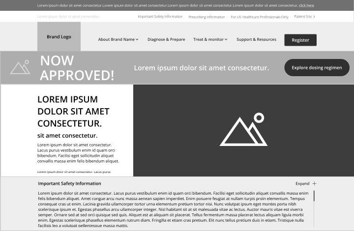
Due to privacy concerns, copy is redacted and visuals are presented in greyscale
Step 3:
UX Strategy & Testing Plan
Based on research insights, I defined two distinct navigation frameworks to test competing structural hypotheses: a unified model versus a role-based model.
Navigation Concept 1: Unified Navigation
Brand Logo
For US Healthcare Professionals Only
Prescribing Information
Patients & Care Partners


Get Updates
Search
About
Patient Profiles
Efficacy & Safety

Dosing
Brand at Your Site
Support & Resources
Navigation Concept 2: Role-Based Navigation
Brand Logo
For US Healthcare Professionals Only
Prescribing Information
Patients & Care Partners

Search
Get Updates
Primary Care
Neurologist
Specialist
About
Patient Profiles
Dosing
Support & Resources

Testing Results:
HCP users consistently preferred Concept 1, citing:
- Faster access to information
- Lower cognitive effort
- Greater confidence they were not “missing” key content
Testing validated that a unified navigation system reduced cognitive load and improved confidence, establishing the structural foundation for the platform.
Step 4:
Design System & Full Wireframes
With the navigation framework validated, I led the transition from structural strategy to scalable system implementation. Information architecture and core user flows were formalized, and a modular design system was established to ensure consistency across teams and future expansion. Fully annotated wireframes were delivered to UI and development teams to ensure implementation integrity.
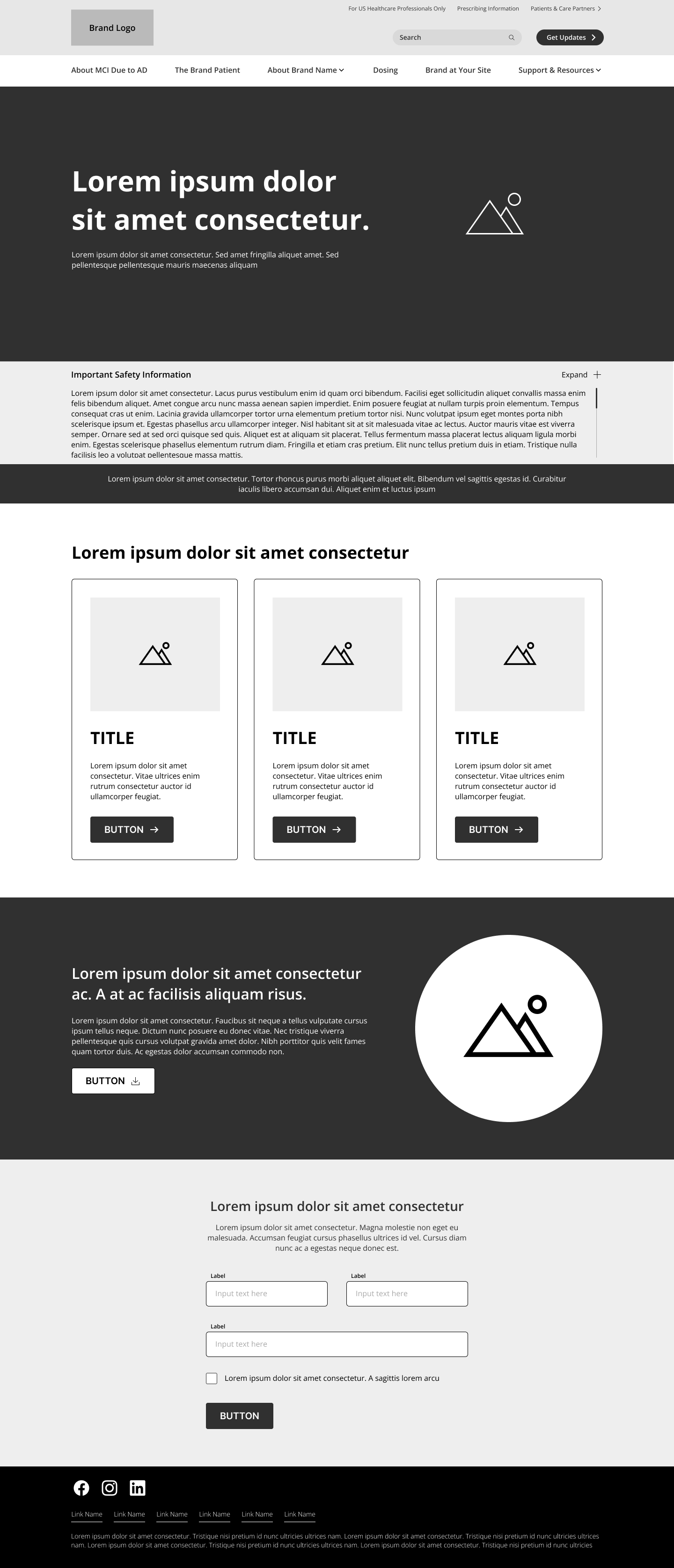

Visuals shown in greyscale wireframe, and copy is ‘greeked’ for confidentiality.
Step 5:
Outcomes & Impact
The final experience prioritized clarity and structural coherence over feature complexity, resulting in measurable improvements in engagement depth and repeat usage within the first six months post-launch.
35% Deeper engagement with educational resources

3X longer sessions with faster access to key educational content

40% Increased return visits from HCPs
Design Learnings
Key learnings reinforced the importance of structural clarity over surface-level personalization, and demonstrated how research-backed decisions strengthen stakeholder confidence and cross-team alignment.
- Structural clarity outweighs surface-level personalization
- Testing strengthens stakeholder confidence
- Attention to detail enables smoother cross-team execution

- Work completed as part of a cross-functional team within a global healthcare organization. Details and visuals modified for confidentiality.