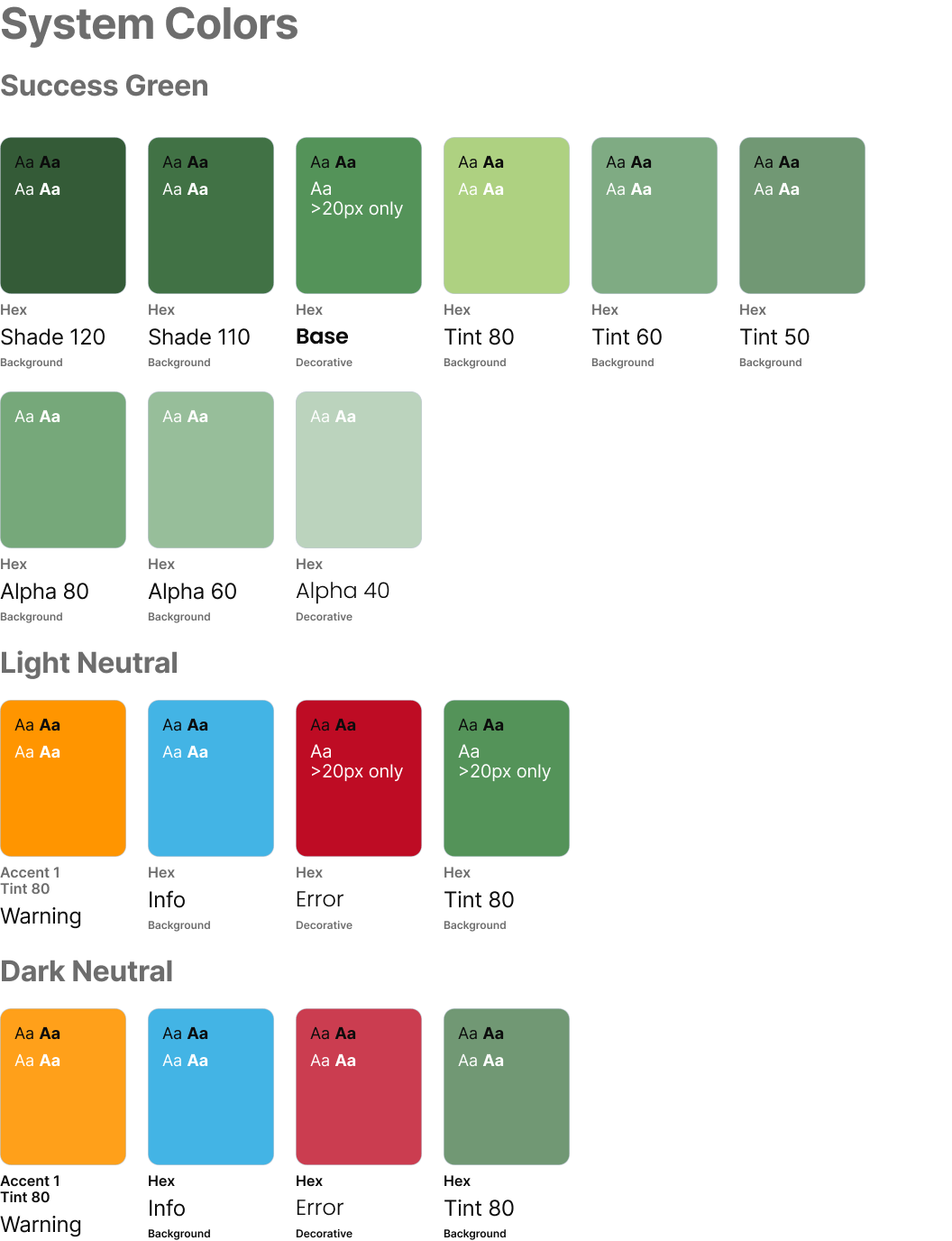
1. Foundations: Tokens + Color Logic
Example from the foundational system library showing primitive color scales, semantic token mapping, and support for light/dark themes. This demonstrates the scalability layer that allowed consistent use across regulated healthcare experiences.
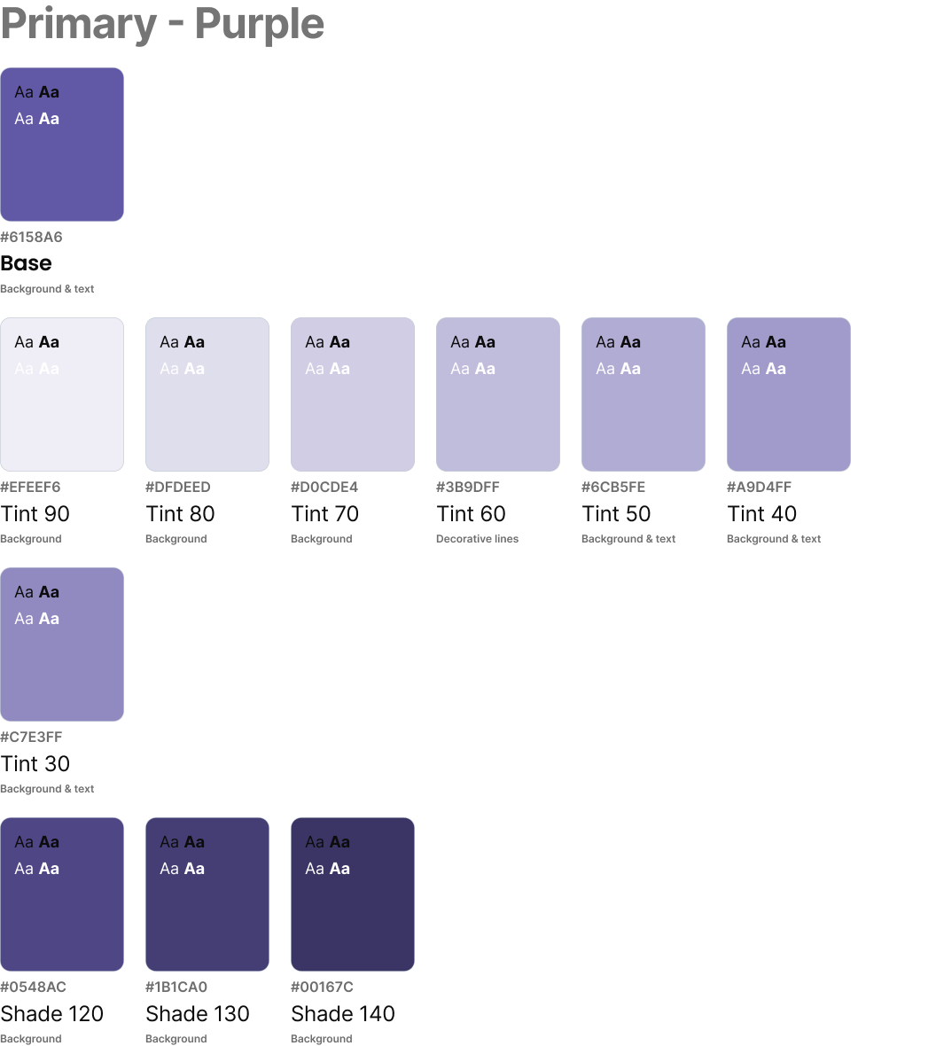
2. Theming + Accessibility States
This example shows light and dark theme behavior, button hierarchy, and visible focus states. It reflects how accessibility and theme governance were embedded at the system level.
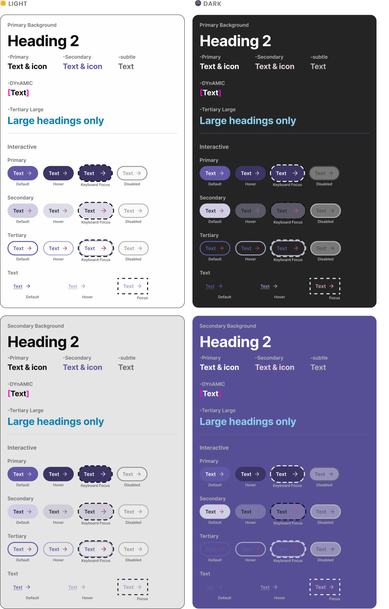
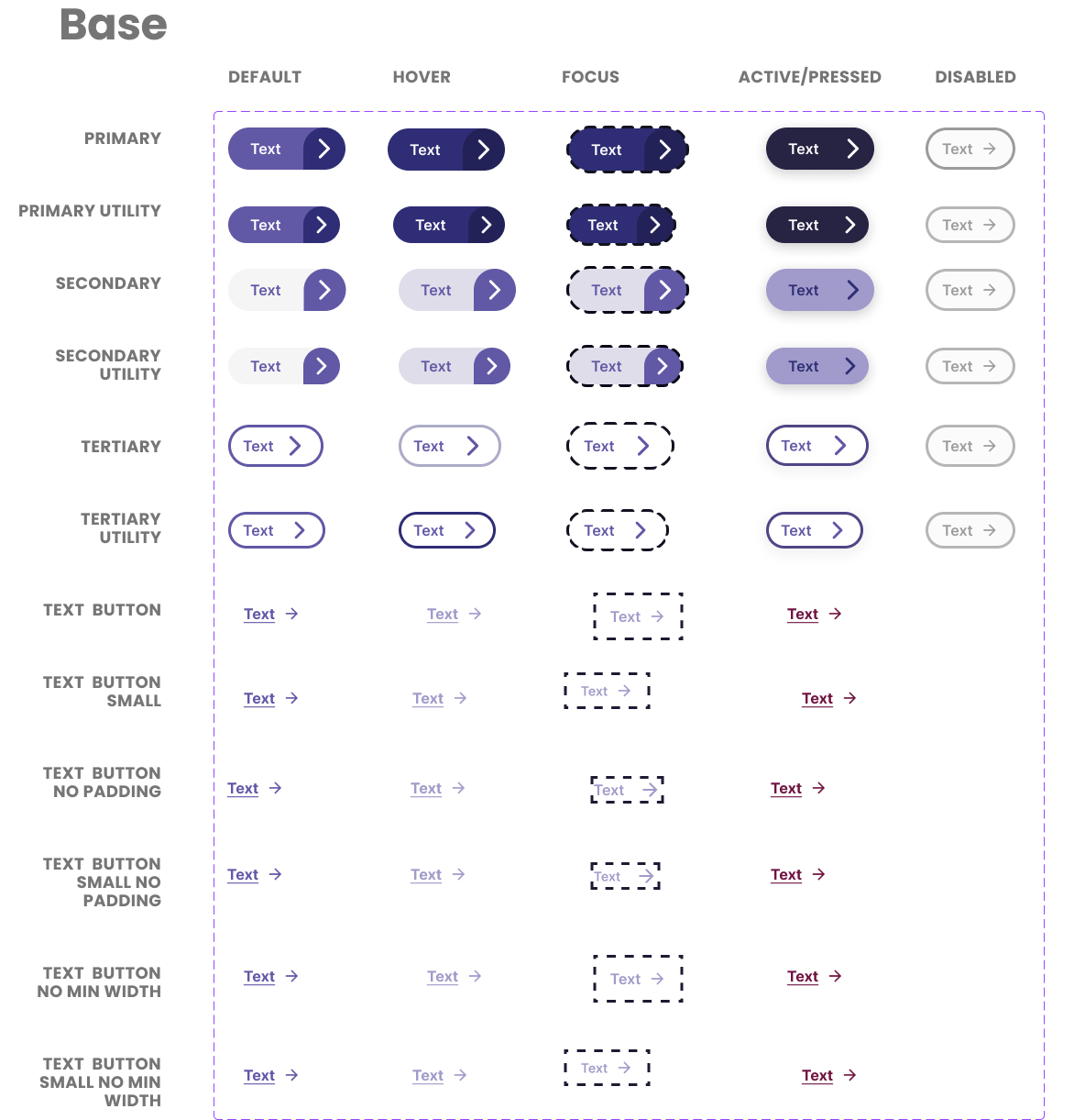
3. Component States + Interaction Logic
Representative component states from the reusable library including default, hover, focus, active, and disabled logic. This level of documentation reduces ambiguity in engineering handoff.
4. Layout Architecture + Responsive Blocks
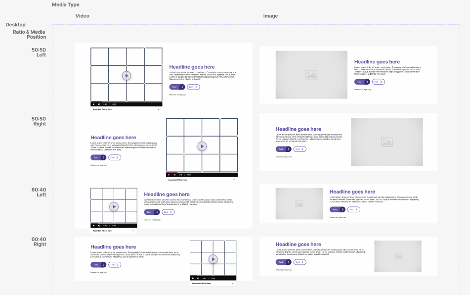
Example layout blocks demonstrate reusable 50:50 and 60:40 media-content structures, responsive stacking, and flexible content density patterns.
5. Navigation + Enterprise Scale
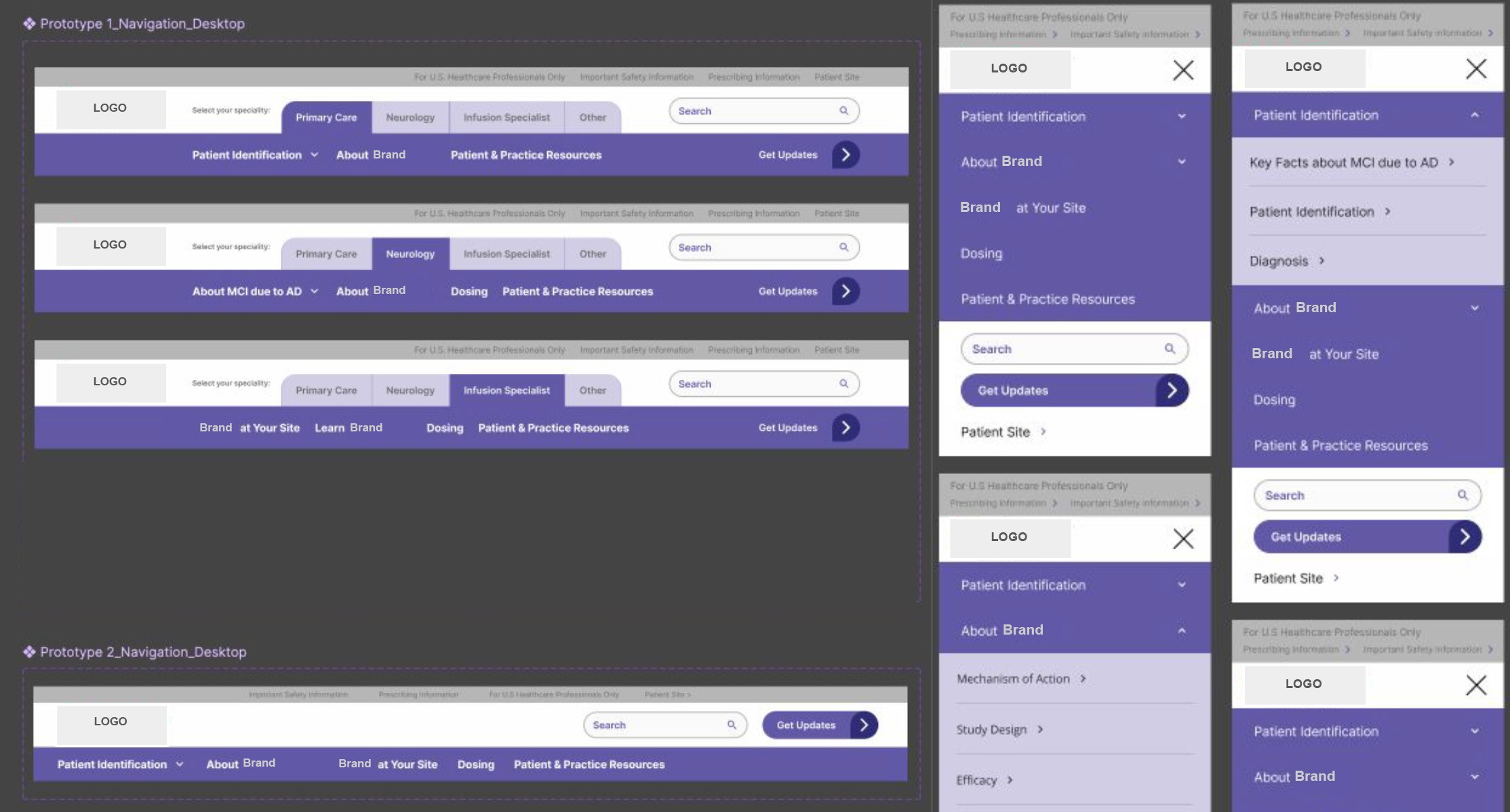
This example highlights desktop & mobile navigation logic, specialty pathways, expandable sections, and search/update modules built for enterprise healthcare users
6. Design System Impact

Improved speed of new page launches by ~30%

Increased consistency across specialty journeys

Standardized UX-to-engineering implementation workflows

Strengthened accessibility QA readiness

Reduced duplicate component creation across 5+ workstreams

Enabled faster onboarding for new designers in
under 1 week
Work completed as part of a cross-functional team at a global healthcare agency. Details modified for confidentiality.